

We have all experienced it: you open an application and before you read a single line of copy, you instinctively feel a sense of premium quality. The interface feels lightweight, intentional, and expensive. This subconscious reaction is not accidental — it is the result of a highly deliberate design language called Glassmorphism.
Characterised by frosted-glass translucency, layered depth, and soft ambient colour, glassmorphism has evolved from a passing design trend into a fundamental pillar of premium digital product design. Apple has embedded it throughout visionOS and macOS. Microsoft built an entire design system — Fluent Design — around it. Understanding why this aesthetic feels so inherently high-end requires looking at the intersection of visual psychology, cognitive load theory, and human spatial perception.
The Anatomy of a Glassmorphic Interface
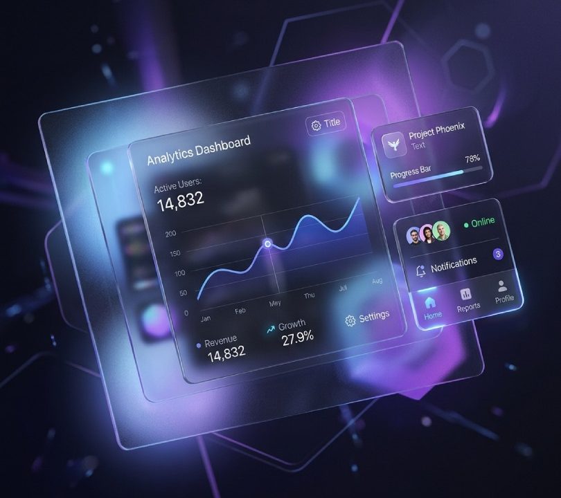
At its technical core, glassmorphism relies on four distinct CSS properties working in concert to simulate physical glass in a digital environment:
- Translucency — Low-opacity background fills that allow underlying colours and shapes to bleed through, creating the impression of a semi-transparent material rather than an opaque surface.
- Backdrop Blur — A Gaussian blur applied to the elements directly behind the glass pane, creating soft depth of field without producing distracting visual noise in the background layer.
- Etched Light Border — A thin, semi-transparent border in a light tone that replicates the way physical glass catches and refracts light at its edges, defining the container boundaries with elegance rather than heavy lines.
- Multi-Layered Depth — Glass panels floating above vibrant, organic gradient backgrounds, establishing a clear spatial hierarchy between the ambient environment, the interactive workspace, and the actionable foreground.
The Psychological Drivers Behind the Premium Feel
The reason glassmorphic interfaces feel inherently luxurious comes down to how the human brain processes visual information. We are wired to interpret two-dimensional screens through the cognitive frameworks developed for the three-dimensional physical world — and glassmorphism deliberately exploits this to create powerful emotional responses.
Spatial Metaphor and Cognitive Hierarchy
Entirely flat interfaces cause cognitive fatigue because every element competes for attention at the same visual depth. The eye struggles to establish a priority order. Glassmorphism solves this by introducing a spatial metaphor — a perceivable Z-axis that the brain immediately interprets as a meaningful hierarchy:
- The Background Layer — The abstract, colourful ambient environment. It provides context without demanding attention.
- The Glass Layer — The active workspace or content container. Its blur tells the brain it is “closer,” making it the natural focus of attention.
- The Foreground Layer — Crisp, high-contrast text and primary call-to-action buttons sitting directly on the glass surface, clearly signalling interactivity.
Because the background is blurred, the brain registers it as spatially distant — simulating real-world depth of field. The user maintains environmental context without being distracted by it, dramatically reducing cognitive load.
The Materiality Effect and Perceived Trust
In physical product design, premium materials — glass, brushed aluminium, polished ceramic — convey luxury because they have mass, catch light, and require precision to craft. Cheap items are made of flat, unreflective plastic. When digital interfaces simulate these reflective, premium material properties, they trigger the identical emotional association in the viewer.
Transparency also builds subconscious trust. An opaque interface feels closed and guarded. A translucent pane feels open and honest — it gives the user a glimpse “through” the interface while maintaining focus on the content above it. This psychological openness reduces friction and encourages engagement.
Reduced Visual Friction and Eye Comfort
Traditional stark-white flat designs create hard, high-contrast edges that fatigue the eyes over extended sessions. Glassmorphism uses soft, diffused gradients that blend gently into the background. By blurring high-frequency background detail, the overall visual noise of the screen is dramatically reduced, allowing the user’s focus to glide effortlessly to the crisp foreground content — a more comfortable and sustainable reading and interaction experience.
How to Implement Glassmorphism Correctly
Transitioning your application or web platform to a premium glassmorphic design system is a five-step process. Following this sequence ensures the interface remains accessible, performant, and visually cohesive:
- Design Your Ambient Background First
Begin with vibrant, organic, fluid shapes or gradient fields in the background layer. Avoid highly detailed photographs as complex underlying imagery makes foreground text difficult to read even with heavy blur applied. - Define the Glass Layer Opacity
Set your card background usingrgba()orhsla()with an opacity between 0.1 and 0.5, calibrated to your application’s light or dark mode. Dark-mode glass generally requires lower opacity; light-mode glass can sustain slightly higher values. - Apply High-Quality Backdrop Blur
Usebackdrop-filter: blur(12px)toblur(24px). This range ensures that elements directly beneath the card dissolve into a soft, visually quiet texture without appearing artificially blurred. - Add the Etched Light Border
Apply a 1px border using a low-opacity white or light grey (rgba(255,255,255,0.20)torgba(255,255,255,0.35)). This single detail is responsible for the majority of the premium glass feel — do not omit it. - Establish High-Contrast Foreground Text
All text placed on the glass surface must be solid and high-contrast with zero inherited transparency. Use dark text on light glass, white or near-white text on dark glass, and verify all combinations against WCAG 2.1 AA contrast requirements before shipping.
Beauty with Purpose
Glassmorphism is far more than aesthetic novelty. It is a sophisticated design system that aligns precisely with how our brains naturally categorise, prioritise, and experience the physical world. By understanding the cognitive psychology behind this aesthetic, designers and developers can create digital environments that feel premium and trustworthy, build genuine brand authority, and sustain user engagement — without overwhelming or fatiguing the visitor.
At Aventra Web Solutions, glassmorphism is not a stylistic trend we chase — it is a deliberate, psychologically grounded tool we use to craft digital experiences that communicate quality at first glance, because in a competitive digital marketplace, first impressions are permanent.